Wednesday, December 24, 2014

Priyu

Merry christmas!
Here's the color sketch- portrait of my niece that I had been painting.

Friday, November 21, 2014

Rangoli 2014

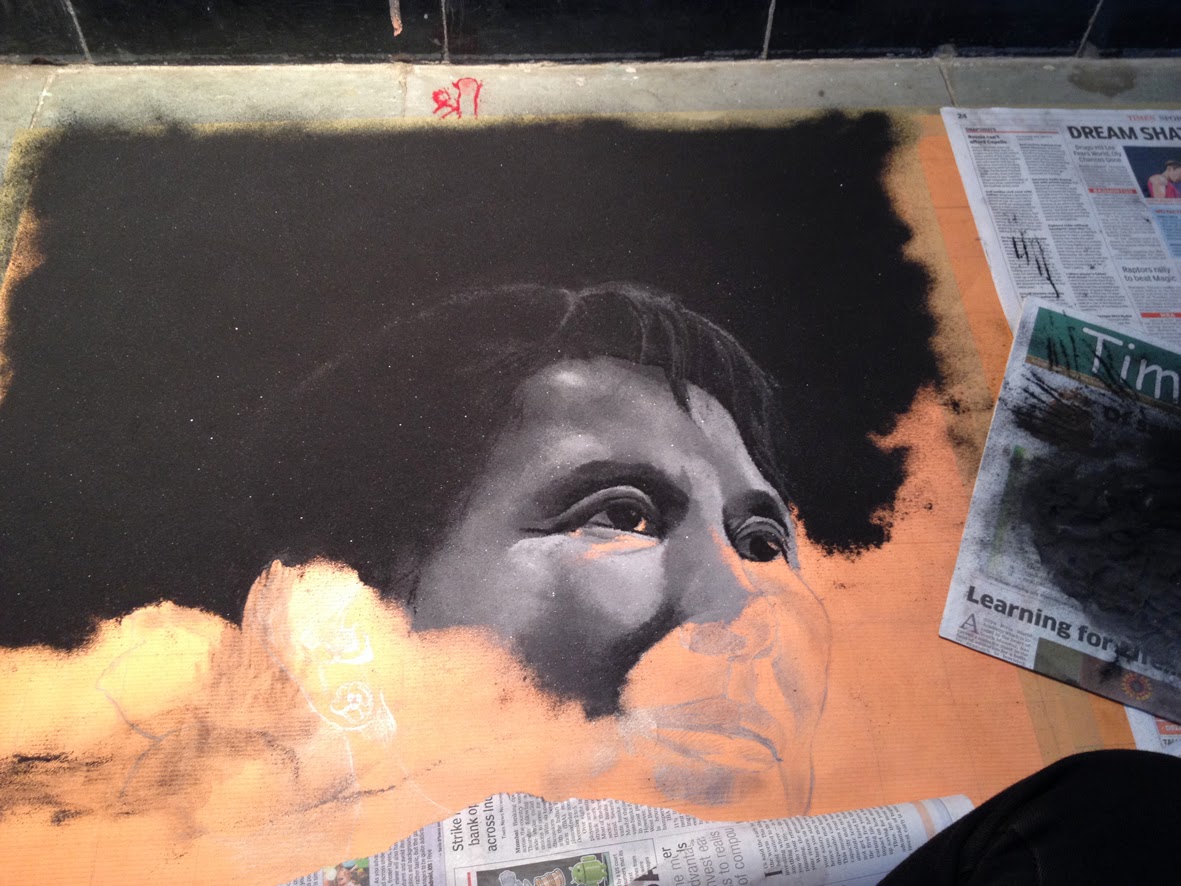
Hello! Here is my rangoli of Aung San Suu Kyi at a portrait rangoli exhibition in Thane, with Kala-Chhand rangoli group. The size is 3 ft x 4.5 ft.


Little something about what Rangoli is~ Rangoli is a traditional Indian art form. The rangoli patterns are created on the floor generally on festive occasions to welcome guests. It is also considered to be a very important part in the spiritual process during the fesivals as there is a belief that when you have a rangoli outside home, the evil forces attempting to enter are repelled. In some traditions, simple patterns are made everyday by women in the family as it is also thought to bring good luck.

---------------------------------------------------------------------

At the exhibition we were supposed to create portraits using this medium of rangoli powder.

There was no theme, and we were free to choose any subject/ portrait. I had to increase the difficulty level from what I had done last time. So either a difficult composition or two portraits.

First day:
We were supposed to start making rangoli from Friday, 14th November. But I had not decided on the subject then. My friend Yogesh was planning to do an old master's painting in rangoli, so I thought may be I should do that too. It will help me understand the hues and forms and values. Got the prints. Then I realized it would be way too difficult to handle multiple figures in varying gestures, their facial details, fingers etc in a rangoli.

Then my uncle suggested I should make portrait of Aung San Suu Kyi. I started looking for her portrait references on the internet. Extremely graceful face and personality that motivates. I was happy to have chosen this subject to portray through the medium of rangoli. Found many beautiful images of hers. Again spent a lot of time deciding which ones to select.  Half a day over and I finally went to the exhibition hall, and asked Yogesh to help me select two portraits, one colored and the other black and white.

That day I only made a few shades from rangoli powder(also known as kolam powder/ chirodi). It's kind of nice grainy powder, white in color that is available everywhere in India. It's made from a special white rock. To create shades, it needs to be mixed with the colored/dyed powder.

I genereally start by creating the primary and secondary colors. Then mix them to create different shades. For this, use 'Lake colors' and white rangoli powder. Mix them well until you get bright, high chroma powder of desired color. If you use too much white, the color becomes dull. So here the proportion of lake colors and white rangoli powder is important.


Second day:
Saturday morning- drew both the portraits. The drawing for a portrait rangoli is usually made on a brown paper, defining all the facial details with pencil since the details drawn directly with the chalk on the floor get lost as you progress.

 The paper is then pasted on the floor. 

I began with the black and white portrait first.
That day I pretty much left it at this stage.

Third day, Sunday:


It was the last day. I finished the b/w face pretty soon in the evening. And felt I was really quick. All the training in fine art, studying the facial structure, anatomy~ had helped and all that. Was happy. Started with the colored portrait thinking it won't take too long.

...but it did. It was 3 am, Monday morning. 17th November. If I was not doing rangoli, I would have been in the farms, watching November's Leonid meteor shower. I always wait for this time of the year, when Leonid meteor shower happens. It looks beautiful, and the feeling when you see the bright, slowly moving stars is amazing. 
Anyway, I was sitting right below this super hot bulb, in a room that felt like an oven.

To create the shades for skin, try mixing all the primary and secondary color powders with white rangoli powder/ kolam powder. More white you mix, lighter the color gets. Add small proportions of red, magenta, yellow, raw umber/sienna/brown, black to the white, to create desired skin shade.  


I was working on the hair constantly. I removed the rangoli powder 3-4 times after putting the colors on the forehead. The few strands of hair on the forehead was the most difficult part. Wasted a lot of time in doing it right. Had to redo the forehead every single time. Everytime I do the strands, they would end up looking like some cuts or dark lines on the forehead. So I just ignored the reference for that part and did what I felt like, just for that part.


For minute details, I generally put colors holding the hand very close to the floor, so that the powdery colors do not spread across a wider area. But when you have to merge two separate patches on the rangoli, hold your hand at a little distance from the floor and start putting the mid-value color from that distance, such that the color spreads on both the patches and creates a nice transition from one value to the other.

It was 5.30 am. Inauguration was in the evening, and I knew that I wasn't going to complete the full thing in a couple of hours.. So decided to go home, to freshen up and return in a couple of hours to finish the rest.

Palette~ Unorganized but looks interesting, I think.


Fourth day, Monday:
I started working again at around 11 am. Came to know that the inauguration was postponed to Tuesday. Was relieved. More time to complete things. The color portrait was frustrating. I was full of self doubt when I could not achieve the results that I wanted to see despite all the efforts I had put in. A friend asked me to leave that colored portrait as it was. And asked me to work on the black and white, doing the hands.


The flowers in the hair were roses, even for the colored portrait. Yellow roses. But I had hardly any patience to look closely and identify those details in the reference image. So just made a few petals. But the details are over exposed while taking the picture and lost..

Fifth day:
Tuesday morning 5.30 am. I have never worked on any rangoli for this long. It was difficult and I can see so many things that I could have improved on, but I guess, it was alright to call it finished.

Some more pictures. Everytime I took pictures, there was a perspective error. And I kept taking shots from different angles, hoping that one of them would give nice results. But no, Im not very happy with the angles, but sharing anyways. It was difficult to take pictures with the light that comes between camera and the rangoli. When you try to move the light up, camera casts  shadow on the rangoli.
You move the light to the right, the portrait on the right would be over exposed and the one on the left is underexposed. Same when you move it to the left. I was tired of clicking. So just sharing a lot of pictures, from different angles.


Some close-up pictures:


Hope you enjoyed reading the post. The Exhibition is open till 24th November, Anandbharati hall, Thane East. from 5 pm to 10 pm. All are welcome.

My friend Yogesh teaches portrait rangoli. 
Here are his contact details if you'd like to join:
email: yogb109@gmail.com
phone:+91 9819941215

Address of the shops that sell these lake colors:
1. Mangal Jyot
Ganesh bhawan, Shop number-9,
Morarji mills,
Opposite Bharat mata Cinema,
Dr. Babasaheb Ambedkar road,
Parel,
Mumbai 400012.
Contact: 24133694, 9821383016.
I think you have to get off at Currey road station and take the east bridge.

2. Enayat: This is at Masjid Bandar. Opposite Jama masjid.

Edit:
30th November: Bombay Times ~~~


Tuesday, November 18, 2014

Some paintings

I was asked to make some paintings based on religious themes. Goddess Lakshmi, Bhagwan Mahavir in kausag mudra and dhyana mudra.

Goddess Lakshmi
Oil on canvas
91 cm x76 cm
For this one I took the reference elephant on the right from Raja Ravi Verma's painting of Lakshmi ji.

Mahavir in kausag mudra
Oil on canvas
91 cm x76 cm

Siddha Bhagwan in Dhyana mudra
Oil on canvas
76 cm x76 cm

They were done in 2 or 3 days each. So to speed up the drying process of oils, I had to add Liquin original. Not too happy with the results in terms of modeling the forms and handling the values. That is what I primarily learnt in Florence, but had very little time to work on those.

Thursday, October 2, 2014

Demo Reel 2014

My new demo reel: 2014


Showreel 2014 from Hemali Vadalia on Vimeo.
Soundtrack is from Little miss sunshine.(I will put the details soon!)

Finally managed to make a reel under 2 minutes with more drawings and illustration work. 

Tuesday, September 23, 2014

Tidy Kids- video

Here is a little video of 'Tidy-Kids iPad game', with a few game elements, illustrations, animations. This one took sooo much longer than I expected, testing all my patience.. with the old video footage in different sizes, different formats, different frame rate, and the conversions for different softwares.  But learnt new things. I plan to use it for my new demo-reel.


Tidy Kids App from Hemali Vadalia on Vimeo.

And here is the portrait of my mother that I started but is put on hold because of the demo reel thing.


EDIT: finito!

Thursday, September 18, 2014

Drift

I finally managed to finish my student animation films. Edited/removed a few shots. Basically made it a bit presentable. I dont like leaving things unfinished and this was in my todo list for quite some time.
So here it is~ Drift, my second short animation for a beautiful song sung and composed by Kori Pop.

Wednesday, August 20, 2014

Tuesday, August 19, 2014

Online shop!

So it's been a month and I'm back home. 
I always thought I would write a very-very long post about my experiences of living in and traveling around Florence, but that's going to take some time. 

At the moment I'm pretty excited to share with y'all my online shop on society6! I have uploaded only one illustration and I do plan to create more illustrations and drawings for the store. 

Here is the link:

Prints and things~ 

Thursday, May 22, 2014

Lorenzo

Lorenzo~ Portrait in Sepia. 
6 days pose.

~: detail :~

Finito! So the portrait of Chiara is finally finished :) 
I always spelt her name as Kiara, but it is an Italian name, so 'Ch' is basically the 'K'. Also, roll the letter R as 'arr' to make it sound really Italian. (kee-aarrah) I'm gradually beginning to love this language :D
Okay, so now that I can't work on it anymore and I have time to look at the picture, I see how I completely forgot to work on the ear! It looks so weird now. I was planning to work on it at the end, but got carried away with the primary details(eyes, nose, mouth). Something to keep in mind, for the next portrait! 

Thursday, May 8, 2014

Some more portraits

I'm quite excited about the portrait painting that we've started. It's my first portrait painting in color. Took some pictures as I was doing it, so here are the initial stages:

In the afternoon, we do the drawing in studio light. This time we could use a soft medium for drawing and I used a sepia stick for this one. Was quite difficult initially, it's my first attempt at using a soft medium. but I really like the dreamy mood it can create. Need to practice a lot with the medium though!
Better pictures soon!

Saturday, April 12, 2014

Portrait in grisaille


So we finished the portrait in grisaille this week. 8 sittings, study from life.

Wednesday, April 9, 2014

Another portrait

Portrait study of Catherine.


A very smiling, pleasant girl with innocent face. Really enjoyed drawing this one. There were many light sources and hence the shadows are not very strong. Learnt about reflex, and about tangibility of different textures. The shades/tone is created using mesh of hatching lines, but they look blurry here. I've no idea why.

Sunday, April 6, 2014

Grisaille study


This is the grisaille study that we did before starting a grisaille portrait last week. Grisaille refers to a painting done in a monochrome palette that can serve as a base for color application. The purpose was of grisaille study is to understand composition, form-(modeling of each object separately) and value(showing the transitions and shadows in great detail, establishing the darkest darks and lightest lights for the final work) ~ but all this with limited colors. For this one, I've used raw umber and white, a little bit of burnt umber and black. It is unfinished, but it did help me understand the play of contrast and difference of edges(sharp/blurry) to create depth and show objects that are closer/ farther away. 

There are many monochrome painting styles, including grissaile(French) and Verdaccio(Italian). Old masters always did a detailed grisaille study before starting to paint, to be sure of the values and composition. It is a stepping stone towards the finished oil painting. One can add layers of relevant value of hue(glazing) to create a full color believable painting with correct values underneath.

Grisaille is based on neutral and warmish gray tones. And Verdaccio is based on cooler grayish green tones. Some believe that verdaccio method can really enhance skin tones to create high realism because of its greenish underpainting(as green is complementary color for the skin. I read somewhere that when you paint with complementary color for your underpainting, it makes the final work more believable.)
Another method that we used here at school is by underpainting in the same colors that we plan to use in the final painting. (It is like creating campitura with different colors) And thus, the first layers of paint laid down serves as a basis for applying the subsequent layers to achieve likeness.

Here is the portrait in Grisaille I am working on; using  raw umber, and a tiny bit of burnt sienna and white. 4 more days to work on this one. 

I was reading about correcting and tone neutralizing for creating believable skin tones in painting, when I read about its use by makeup artists. It is really interesting to know how the same principles were used in the make up industry during the switch from black and white to color films. The makeup artists had to study all the principles of color and its behavior in different light(warm light/cool light) to do the color corrections while applying makeup. Back then, there was no technology to aid the artist. Only color theories to experiment with. So it was like applying right quantity of green shade(complementary of red), purple shade(complementary of yellow) so that it neutralizes the effect of red-yellow skin blemishes when captured by camera, with a certain light(warm/cool). Even the actors had to undergo several tests to make sure that the shades of green/purple looked correct for their skin color. That's the reason, they say makeup is an art-form, and it's interesting to know its history as to how it has evolved, even when there are so many options (concealers!) to aid makeup artists now.

Tuesday, April 1, 2014

Ritratto a Firenze!

I had taken these pictures in February near the entrance of our building. Really liked how the sunlight made everything look so dramatic. Color of the reflected light looks lovely in the pink one. It was a beautiful day. I had thought of taking portrait commissions while I am here in Florence. So I had to have a nice poster. And I wanted to have handmade type. So used paper quilling to create these typography, Ritratto for Italian, and other in Inglese! 
I'll edit them in photoshop and use them in the posters. Also working on a series of portraits, hope to complete them soon!